fig. 1.1 ; References
Artist's name : Joseph
The human eye prefers continuous visual flow over separated objects, following paths, lines,and curves in a design. For example, the stairs are going in an upward direction creating depth to appear that the steps are still continuing.The subject in this work adds value to this continuation because it looks that there are still more steps to go.
fig. 1.2 ; Reference
Artist's name : Rocky
The human eye prefers complete shapes, filling in missing visual information to perceive completeness. For this picture, the black shapes on the giraffe are enough to distinguish it when set against a white backdrop.
fig. 1.3 ; Giraffe
Artist's name : Alex Schmidt
Group related design elements closely;
space unrelated ones apart. Proximity
suggests connection, aiding organization and
layout structure. For example ,the below
picture as the crows- although individual
crows- are grouped together in the viewer’s
perception in the shape of a woman.
fig. 1.4 ; References
Artist's name : Jeff Hopkins
Objects are perceived as foreground or
background, standing out or receding
which play with positive and negative
space to build relationships and
create wholes with the sum of their
parts. For this picture, the shape of a bird as the foreground.Then, we see a plastic water bottle inside the bird's beak as the background. The message of this image probably to convey everyone that we must stop littering in order to save the environment.
fig. 1.5 ; Save Them
Artist's name : Beto Cortes
This law states symmetrical elements
are perceived as a unified group, akin
to the law of similarity.Based on this picture,the color,
shape are asymmetrical, but creates
a dynamic visual balance. Even with
the contrast between the two
different faces, it is very
interesting to combine them in a
symmetrical way,which kinda
ironically reflects the relationship
between joker and batman.

fig. 1.6 ; The Dark Knight
Artist's name : Molly Chaos
The pairing of dissimilar elements, prevents monotony
and adds visual interest. It emphasizes points and
expresses content. For example ,the contrast in colour really stands out between the white and yellow. Putting the body falling in pure black allows for visually appealing features that create beautifully contrasted art.
fig. 1.7 ; Fall in Love
Artist's name : Bader Asaleh
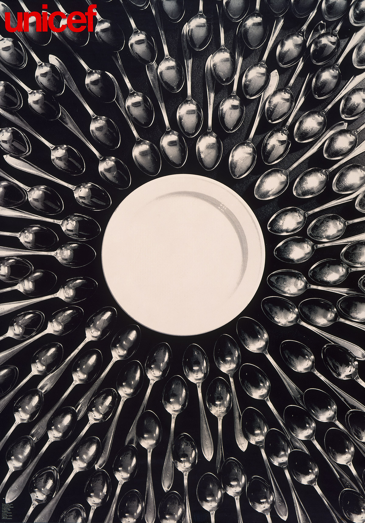
Emphasis creates focal points in design, drawing attention and conveying significance. Achieved through contrast, size, color, positioning, or other techniques like this design uses the repetition of spoons to lead your eye towards the plate in the middle.
fig. 1.8 ; Unicef
Artist's name : Jukka Veistola
Balance in design distributes visual weight, achieving
stability and harmony through symmetrical, asymmetrical,
or radial arrangements. For example , this photo from left
and right have the same people standing on the high
ground, the whole picture is relatively harmonious,
smooth.
fig. 1.8 ; Balance in art
Artist's name : Grace Fussell
Repetition in design uses similar elements for
consistency, establishing rhythm, pattern, and
continuity for a cohesive presentation.For this poster
from coca-cola is a perfect example of
using repetition to achieve a sense of unity and to portray
a certain message. The repetition of the coke bottles not only looks
like a smile, but also creates a sense of unity with
the repeated coke bottle.
fig. 1.8 ; Open Happiness
Artist's name : Coca-cola
Movement in design creates the illusion of motion,
guiding the viewer's eye through dynamic arrangements of
visual elements. This example makes the viewers eye follow the path it creates out of type, warping and swirling, giving it massive movement.
fig. 1.9 ; Life-experience poster
Artist's name : Mirko Humbert
Harmony and unity in design merge diverse elements into
a cohesive whole, conveying a unified message or
aesthetic through careful attention to composition,
color, and typography.This illustration uses Unity to create a seamless
visual harmony.
fig. 1.9 ; International women day
Artist's name : Angelinabambina
Symbols are simplified visual representations conveying
complex ideas quickly and effectively, playing a crucial
role in communication.
Combining words and images enhances communication,
leveraging verbal and visual strengths to convey
messages effectively. Effective integration considers
hierarchy, placement, and the relationship between text
and visuals for impactful design.
fig. 1.11 ; Massacred in the name of greed
Artist's name : Blair Davidson
3. Pick and briefly describe one
goal from the
United Nations’ Sustainable Development Goals (UNSDG).
4.Select an existing art/design work that revolves
around that goal of your choice. Beneath the image,
include the credit line of the art/design work (title of art/design work,
artist’s/designer’s name, year, size, medium, source link). Some works may not
have all these but provide as complete as
possible.
Design work that I choose for goal 3 (Good Health and
Well-being) :
fig. 1.3 ; Older Really Can Mean Wiser
Artist's name : Christopher Silas Neal
Date : Oct 2017
UNSGD Goal That I choose : Goal 3 Good Health and
Well-being
For the UNSDG goal 3 Good Health and Well-being
is raising awareness about mental health,
promoting mental well-being, reducing stigma, and
advocating for mental health services and
support. By promoting health and well-being
across all age groups and demographics, this goal
seeks to reduce preventable deaths, improve
overall quality of life
Rationale
The main reason I chose this photo is because I
think it reflects everyone's daily mental state,
mirroring how we often present our positive side to
others while silently grappling with our own
internal struggles. As depicted in this image, we
tend to showcase only the blooming aspects of
ourselves, concealing the withering parts that
symbolize our inner turmoil. It serves as a poignant
reminder of the internal conflicts many of us face,
underscoring the importance of acknowledging and
addressing our mental health concerns.
Design Principle
(109 words)
Weekly Feedback
Week 2 (12/2/2024)
Initially the photos I chose didn't pass because they
were taken from photos in the article, not from inside the
author's own portfolio. During the second review, Mr.Zeon
asked me about what are the design principles used in the
photo, and I initially said contrast, symbol and emphasis,
but he said that emphasis was not the best choice for the
photo, and then he told me that balance was more
appropriate.
Week 3 (19/2/2024)
All work is good and ready to submit . Just need to
adjust the size of references pictures and add the word
count.
Self-reflection
In Task 1, I learned about 9 design principles gaining
valuable insight into how design functions.Initially, I struggled to grasp some of these
principles, but my Mr. Zeon provided corrections and
explanations, helping me understand where I went wrong.
I came to appreciate their significance in creating
cohesive and attention-grabbing designs, as well as the
importance of rhythm, flow, and variety in design. This
task not only increased my awareness of familiar design
principles but also introduced me to new ones that I aim
to apply more effectively in my future work.
Further Reading


Comments
Post a Comment